List of Company Logos with Name and Pictures - Summary
Tata Group
Tata logo is eye-catching for its simplicity. ‘T’ letter in blue stands for the group’s reliability, strength, and prosperity. It is also signifies tree of trust and fountain of knowledge. Is designed to look good on its trucks and cars. Being largest multinational conglomerate of India Tata Group symbolizes quality for the past 100 years. Tata logo was refurbished from time to time. Present logo is a modified version of the 1999 logo as Chairman Ratan Tata wanted to promote the company worldwide with a unique brand symbol and with a slogan ‘improving the quality of life.’
State Bank of India
SBI logo represents a key hole which means the common man can unlock all his banking needs. Originally SBI logo was a banyan tree when first designed in 1955. The current logo was designed in 1971 by Shekhar Kamat of National Institute of Design (NID), Ahmedabad.
HDFC Bank
Housing Development Finance Corporation (or HDFC) logo shows a square block at the center resembling a building and the four corner walls being a focus symbol seen in cameras and represented in red. The geometric design of the logo in black, white and red make it strong in terms of visibility as a symbol. The white H.D.F.C. letters in blue background has aesthetic appeal and follows the same geometric pattern. Below the logo is the legend: “We understand your world.” It is concept that reassures those who want a roof over their heads through housing loans. Logo signifies trust. HDFC provides housing loans to all and invests in housing development sector. Logo conveys a message that the bank helps in building homes for people who can dream of building one.
Airtel
Airtel’s new logo is a single ‘a’ presented on a red background followed by Airtel written underneath the letter ‘a’. Re-designed in 2010, the red colour represents dynamism. The unconnected letter ‘a’ represents ‘no boundaries’ as Airtel is exploring the world. Today it is the world’s fifth largest telecommunication company and the largest mobile service provider in India.
Wipro
Wipro – one of the top MNCs of India – had to re-design its logo to a dark integrated rainbow coloured sunflower depicting the company’s integrity and values. Rainbow is the union of colours and Wipro journey to top is no less vibrant. The journey began in 1945 with a vegetable oil company and today it has branched into varied fields like IT, electrical and furniture. Initially, logo was a sunflower designed in black and white.
Axis Bank
‘A’ represents the word Axis in the bank’s logo. It also depicts a strong growth path for the bank supported by a strong base indicating that the bank is moving from a position of strength. Earlier, known as UTI Bank, its burgundy colour still remains. With a customer base of 60 lakhs it is one of the high-performing banks of India.
Star Plus
One of the leading channels of Indian television, Star Plus, unveiled a new logo in 2010 with Rishta wahi, Soch Nayi. The rebranding was done to project an image of entertainment with new fresh thinking. It also was meant to represent a modern Indian woman who evolved into different roles following dramatic changes in lifestyle and society from being a housewife to taking charge of different roles outside the ambit of a typical Indian woman.
Asian Paints
In October of 2012, Asian Paints unveiled a new logo to come closer with its customers highlighting interior décor for retail and commercial segments across India. This changed its brand identity. The attempt was to stir customer’s imagination with the flowing ribbon formation that created the ‘AP’ design implying easy flow, smoothness, dynamism and enabling customers to design the home of their dreams.
Bajaj Auto
In January of 2004 Bajaj Auto unveiled its new logo and this new visual identity re-emphasising its brand values. Brand essence for the new Bajaj has been defined as “Excitement”. Bajaj promises to live up to its 5 brand values viz., Learning, Innovation, Perfection, Speed and Transparency. Bajaj replaced its traditional hexagonal symbol with an open abstract form of stylized B, the “flying B” as it has been named to represent style and technology to denote speed and transparency.
Suzlon Energy
Suzlon is a pioneer in wind energy and a leading renewable energy company in the world. Present in 19 countries across 6 continents its logo represents the wind flowing in green background. The green colour represents a greener tomorrow and a safer future.
UltraTech Cement
Aditya Birla logo was brought out in a new avatar by the Chairman of the group Kumar Mangalam Birla to convey change and transformation. The logo change came after 20 years in scaling new heights which has been truly transformative. Today UltraTech Cement is largest manufacturer of grey cement, Ready Mix Concrete (RMC) and white cement and one of the leading cement producers globally. UltraTech as a brand embodies ‘strength’, ‘reliability’ and ‘innovation’.
Larsen & Toubro
The L& T logo has remained unchanged from the early beginnings. First two letter of the company forms the logo conveying its top-class quality and sustained leadership in its major lines of business across seven decades. This India’s multi-national conglomerate headquartered in Mumbai was founded by two Danish engineers taking refuge in India. It is involved in engineering, construction, manufacturing goods, information technology, and financial services, and has a global spread of offices and advanced manufacturing facilities in India, China, Oman and Saudi Arabia.
ITC
ITC was incorporated on August 24, 1910 under the name Imperial Tobacco Company of India Limited. As it slowly Indianised, name was changed to India Tobacco Company Limited in 1970 and then to ITC Limited in 1974. Today headquartered in Kolkata, West Bengal it is an Indian conglomerate. Its diversified business includes five segments: Fast-Moving Consumer Goods (FMCG), Hotels, Paperboards & Packaging, Agri Business & Information Technology. The logo symbolises two blue arms folded in form of namaste in a suffused white background. But the legend below is clearly visible: Enduring Value.
Unilever
Hindustan Unilever Ltd is a multinational consumer goods company based in Mumbai and is owned by Anglo-Dutch company Unilever which owns a 67% controlling share in HUL. Its products include foods, beverages, cleaning agents, personal care products and water purifiers. The U in Unilever logo is filled with variety of random images. But every single image depicts the range of products it manufactures.
Doordarshan
NID Ahmedabad student is said to have devised this interesting logo. Doordarshan was considered one of the largest broadcasting organizations in the world in terms of studios and transmission development. This classic form stands test of time.
Hindustan Petroleum
The future is full of energy is what the logo seems to signify with its curved lines joining together like a stream of energy fuel being poured into a vehicle. The visual form registers instantly. Additionally, colors of red in the bold initials HP within blue circle provide contrast between letters and shape giving elegance of its own. The symmetry makes the logo look simple and balanced.
Welcome Group
Atithi devo bhava seems to be the theme as a mark of welcome. ‘Truly Indian’ is the theme of ITC for its ‘Welcome group’ chain of hotels. The letter envisages Namaste (traditional gesture of ‘Welcome’). Conceptually, this logo means India is a unifying force for different cultures and religions.
National Dairy Development Board
Operation Flood is the symbol of National Dairy Development Board. The “drop (of milk)” logo symbolizes the Operation Flood movement started by Father of Milk Revolution in India Verghese Kurien for NDDB. The White Revolution changed the face of India giving livelihood to thousands of milkmen in Anand and beyond. The timeless simplicity of the drop of milk signifies the value of milk, its sustenance for people of India making India largest producer of milk in the world.
Punjab National Bank
Designed in 1984, the logo captures the ethos of the letter in Gurmukhi to conceptually complement Punjab National Bank (PNB). The orange colour is India’s traditional colour. The Gurmukhi letter form enclosing a circle compliments the identity of PNB as a nationalized bank.
Steel Authority of India Limited
The logo using the dark triangular form with an upward direction indicating growth and development of steel industry. The solid rhombus enclosed within the triangle seems to agree with the fact that SAIL infuses high level technical and managerial expertise. SAIL incidentally is the largest integrated steel and Iron producer of India with a sound infrastructure for the industrial development of the country through its integrated steel plants.
TITAN
This Logo was designed in 1987 for TITAN Industries which is a joint venture of Tata Group and Tamil Nadu Industrial Development Corporation (TIDCO). TITAN exports watches, accessories and jewellery in both modern and traditional style designs. The most attractive aspect of the logo is play with letter ‘T’ creating a circular hallow around it resembling a watch dial and the internal parts of machinery. Simple and elegant, it reflects traditional ethos combined with modernity of Titan products.
Airport Authority of India
Designed in early 1990s, the Airport Authority of India logo uses triangular form and the wings of an airplane kindling vision of airport. The upward accent of the triangle matches with AAI’s responsibility in creating, upgrading, maintaining and managing civil aviation infrastructure in India.
Trade Fair Authority of India (now India Trade Promotion Organization)
When Indian government ventured into external trade in 1974 this logo was designed for Trade Fair Authority of India. It is interesting to see the fusion of letters T & F signifying preservation of traditions of trade and investments along with modern identity of ITPO. It also signifies India exercising its authority through trade through fairs and exhibitions both at home and abroad.
Hero
This logo is difficult to comprehend though red and white pieces seems to convey abstract ‘H’ even if difficult to spot at first sight. Hero in bold red is eye-catching but black and blunted arrow above the smaller sharp one (right of vertical red rectangle) makes one wonder what is the relevance of this logo. This is rare logo indeed designed to make one ponder.
List of Company Logos with Name and Pictures PDF Download
RELATED PDF FILES-
 List of New ICD-10 Codes for 2025
-
 List of Halal Products in India
-
 List of GI Registered Handicrafts
-
 List of Tools and Equipment to Perform Practical
-
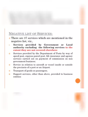 Negative List of Service Tax
-
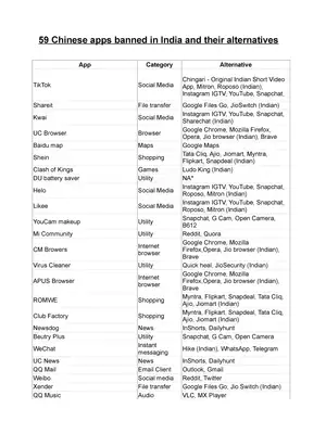 List of Chinese Alternative Indian Apps
-
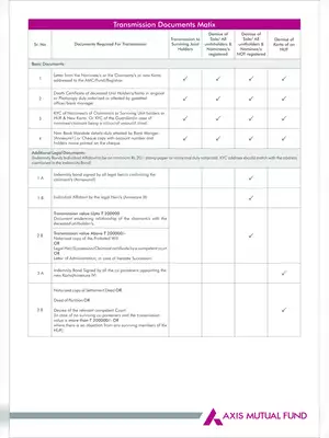 Axis Mutual Fund List of Documents required for Transmission
-
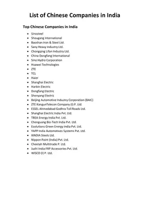 List of Chinese Companies in India